Soccer Outaouais
Quand la confiance devient créativité.

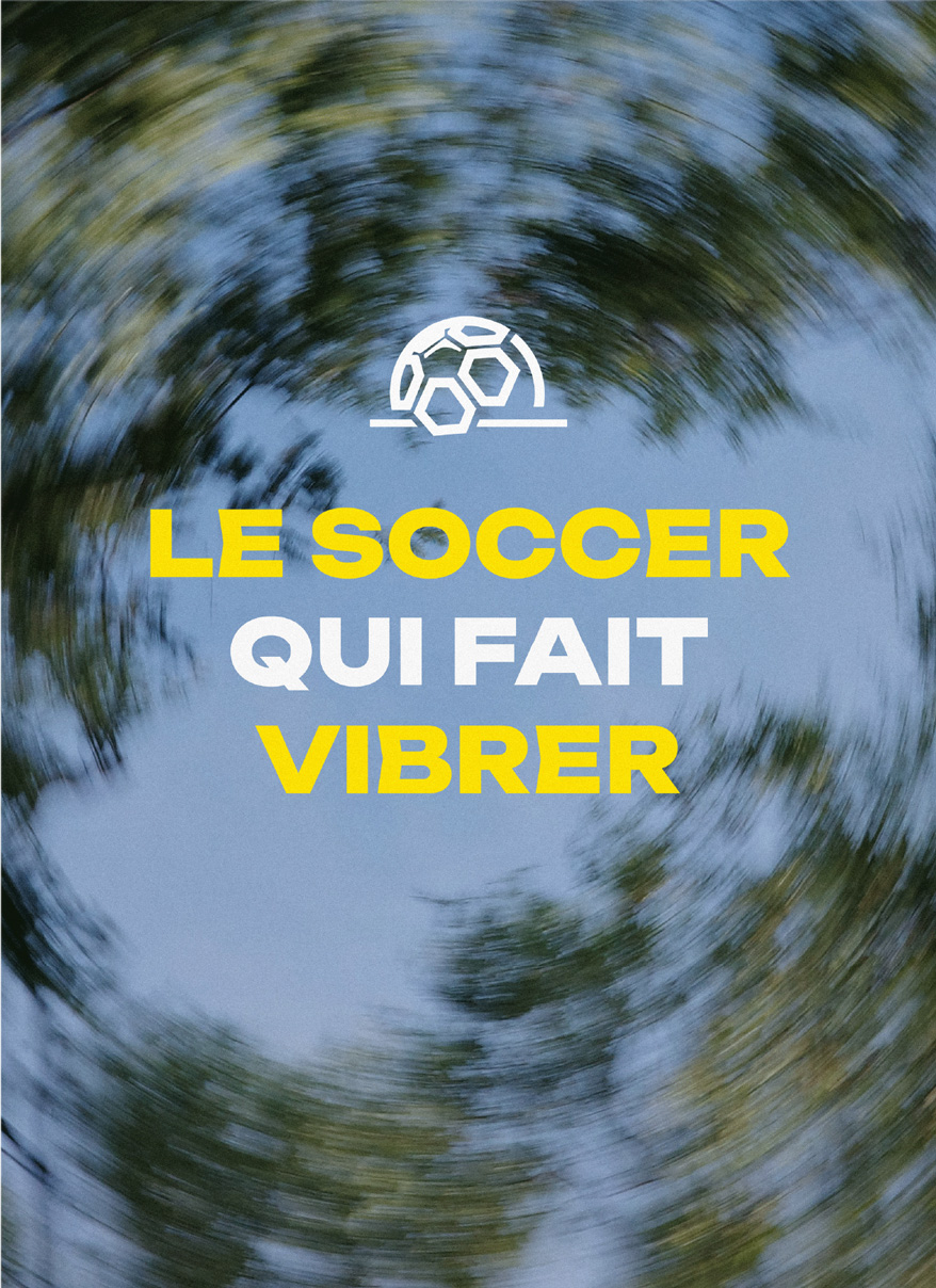

THE CHALLENGE
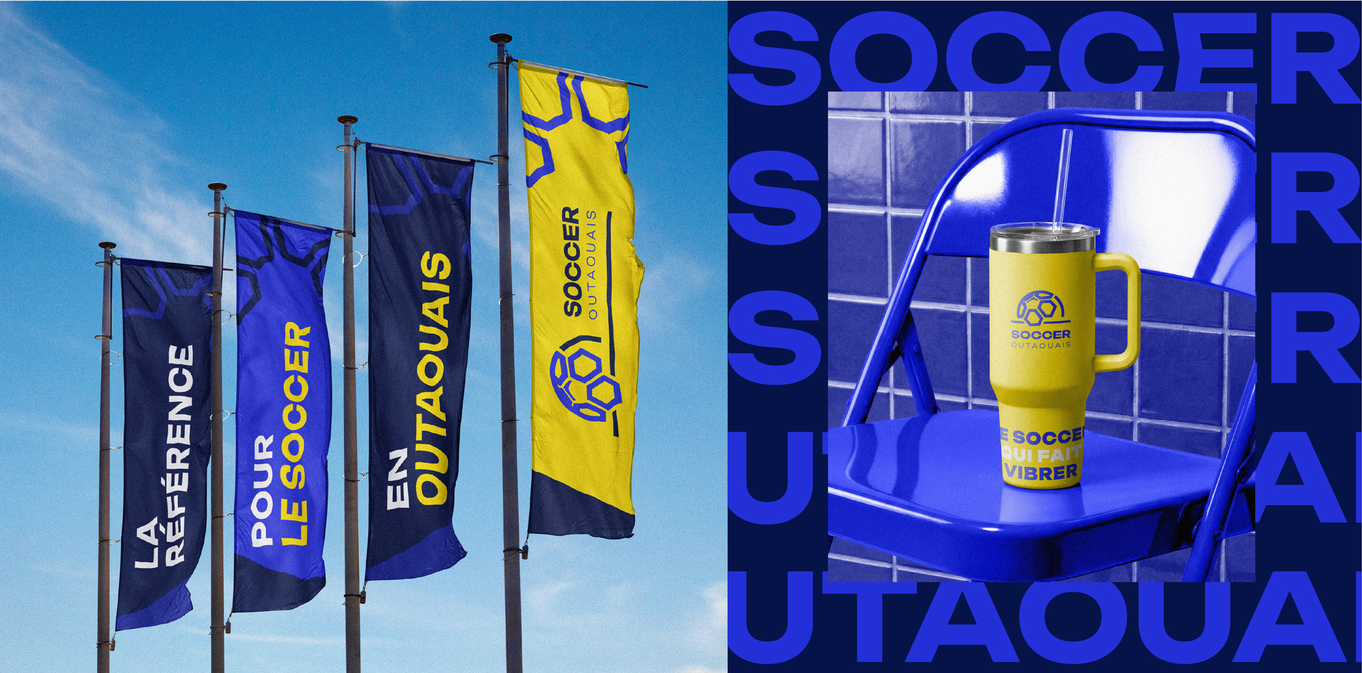
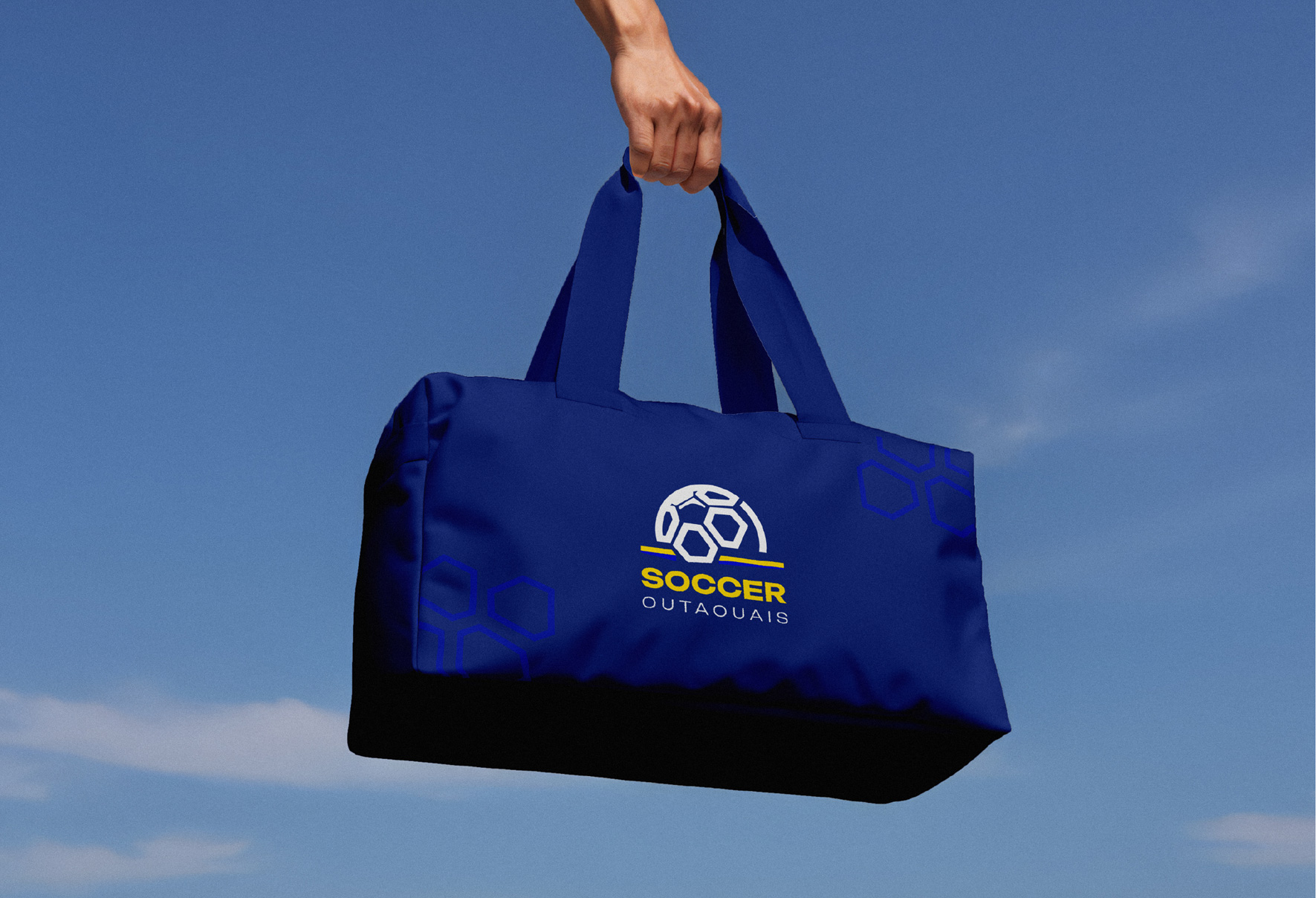
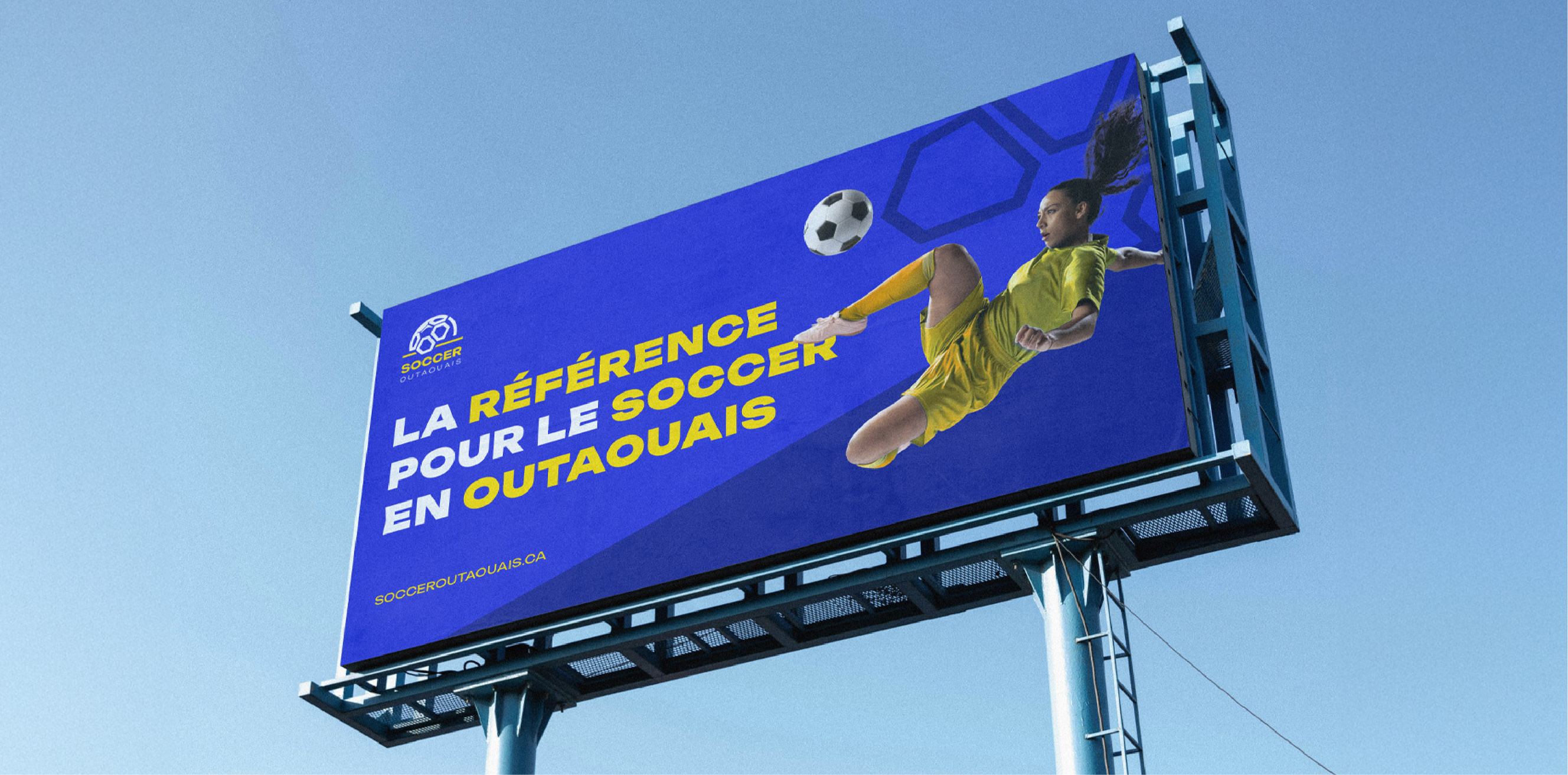
Soccer Outaouais needed to raise its brand perception to be taken seriously by major sports organizations like Soccer Quebec and Soccer Canada. The challenge: to modernize the identity without losing the regional essence, to create a professional image that inspires confidence in national authorities while remaining accessible and inspiring for the thousands of young players and families in the Outaouais region. It was necessary to respect the heritage (the iconic colors blue and yellow) while projecting a vision of contemporary leadership. In other words: to transform a solid local organization into a key player in Quebec soccer, capable of playing in the big leagues.
OUR CONTRIBUTION
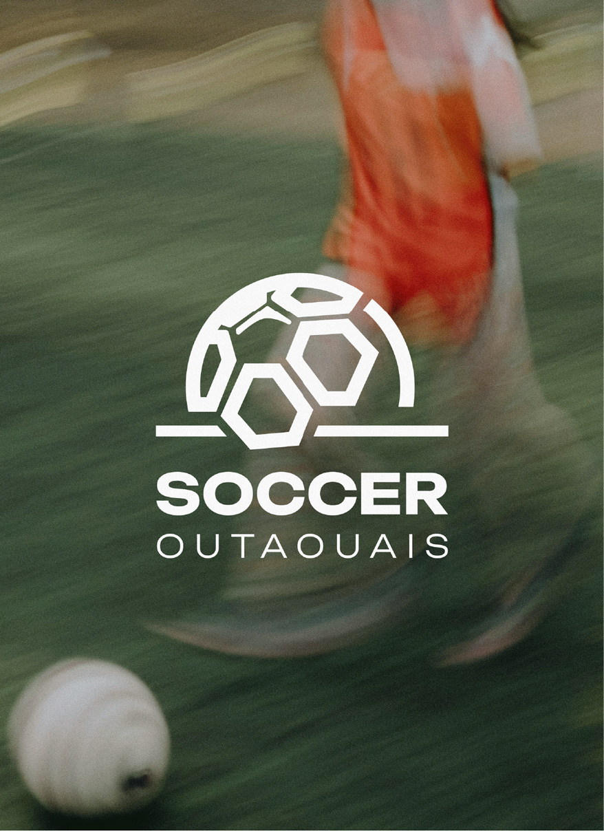
At LX, we have carried out an in-depth strategic transformation to position Soccer Outaouais at the level of major sports federations. From clarifying the positioning (who they are, their unique impact in the regional ecosystem) to creating a strong and modern visual identity (bright color blocks, movement-oriented design, simplicity that commands respect), through the design and development of a successful website — each element has been designed to project professionalism and credibility. The result: a brand that inspires confidence in national authorities, that mobilizes its community, and that positions Soccer Outaouais as the leader in regional soccer in the Outaouais. Coming back to work with our very first client after 7 years to support them in this ramp-up is proof that we are growing together.
.png)